We have created a table showing our availability times to narrow down when we can film and when we can't. The boxes in red show that we cannot film at these times due to work, therefore we will have to work around this situation.
Tuesday, 18 December 2012
Plan of Action!
We're currently making a plan of when and where we're going to film as we all know it has been postponed due to the weather! That's inexcusable now as we must film! :) I'll upload the plan as soon as we're done, hopefully we will break it down to a more thorough
plan showing which shots we will use, too. We need to know each others availablities because of work, so we will make a table showing the times we can film as well.
Monday, 17 December 2012
Wednesday, 12 December 2012
Audience
I'm currently working on a questionnaire on what the audience would like to see from our short film. Our target audience will mostly be people of a similar age to ours (16-20). We believe this is the best age range to apply our short film too as we know more about what people this age like, as obviously, we are in this age group.
Tuesday, 11 December 2012


Tuesday, 4 December 2012
The Impact of Charlie Chaplin
For further
research I have looked in more depth at Charlie Chaplin to get a better insight
as to why his Silent Films were so important and how he became so iconic.
Sir Charles
Spencer "Charlie" Chaplin was an influential actor and filmmaker during
the silent film era in the early twenty-first century and the first
international film star, signed at the young age of nineteen. Prior to
Chaplin's breakthrough, cinema in this time period was fairly dull using heavy
subject matters that became repetitive. Similarly, it is apparent that in
Chaplin's films, there are elements of drama and in some cases tragedy; however,
the thing which made his work original was that he portrayed them with a comic
tone.
The biggest
inspiration for Chaplin was his mother, claiming she was one of the best
pantomime artists he had ever seen. His years with the Fred Karno Company also
had an impact on him. He then emerged into an iconic figure and an inspiration
to many people due to creating the slapstick style of comedy which is still
around to this day, and also for his different persona which he named “The
Tramp”, more than likely inspired by the American genre of film called
Vaudeville.
This persona
(first seen in Making a Living) is said to be one of the most iconic images in
cinema ever, with it being recognizable to even people that have not seen a
Charlie Chaplin film. “The Tramp” influenced other well-known figures such as
Laurel and Hardy, showing the development of cinema, bringing their new ideas
as well as Chaplin's original ideas to film. This shows that if he never
initially brought his own slapstick comedy to film, then people may not have
ever known a comedy like it as there would be nothing to develop from.
Chaplin's
original ideas also improved in time as he learned how to change the pace of
the action content of a film, making it not constant action throughout, but
reeling the audience in so that it builds up suspense and uniqueness. A Woman
of Paris is his only drama film which was part of the development of
sophisticated comedy films, shown by it influencing heavily in Ernst Lubitsch's
silent film The Marriage Circle.
The way in
which Hardy experimented with several different types of comedy allowed other
filmmakers to become more ambitious when producing their own films as it gave
them inspiration, for example French comic actor, director and writer Jacques Tati
states “without him I would never have made a film”, and in doing so Tati then
went on to be named forty-sixth Greatest Movie Director of all time. Another
innovative filmmaker, René Clair, used the bold statement “he inspired
practically every filmmaker”, also showing how influential his film making style
was and how it has been developed over time.
Slapstick
comedy can be seen in more modern films as well such as Frank Coraci's The
Water Boy, Dennis Dugan's Happy Gilmore and the franchise of comedy films Scary
Movie. Although cinema has evolved to a more professional standard with there
now being colour and sound, it is obvious that Charlie Chaplin was the reason
why so many filmmakers create products based around a comic nature, all down to
Chaplin's revolutionary ideas, thus making him an extremely significant figure.
Thursday, 29 November 2012
Romantic Silent Short Films
Main points about the silent, romantic short film Same Old Story as shown below:
- Follows the conventions as seen in many of Charlie Chaplin's silent films (slapstick humour, black and white and dressed in a similar style to Chaplin)
- Music is fast paced to link with the energetic movement in the moving image
- Man trying to win over the girl, conventional of what it was like in the time period it's based around.
Here is a YouTube clip I found which includes scenes from silent film City Lights starring the iconic Charlie Chaplin. Here, we see the whole idea of the first short film and what it is based around. Our short film is not going to be the male chasing the female due to the different conventions of society nowadays, but it is in fact the female (Zoe) being caught up about the male (Stephen). It will include Stephen showing interest up until the disequilibrium. It is possible that we will use slapstick comedy similar to Chaplin's silent films once Zoe realises her feelings for Stephen but we have not decided at the minute.
Wednesday, 28 November 2012
Typical English Weather..
Due to the weather we were unable to get location shots at the weekend! This weekend will be when we defintiely get them. With practically all of our filming being outdoors it has been vertually impossible to film. Even filming the indoor shots would include the weather as it would be visible through windows etc.
Thursday, 22 November 2012
Locations
We're going to take location shots at the weekend as we have more time to get the different locations. We're basing it around stereotypical locations where teenagers normally go i.e. town centre (Newcastle), parks, cafe's etc
We will post the images as soon as we get them! :)
Tuesday, 20 November 2012
Reason's for Choosing a Chorus
The reason Kelsey and I have chosen to include a chorus origianally seen in Greek tradgedies is because we believe it is fairly abstract which is often apparent in most stingers. With the chorus symbolising the relationship between the two main characters, it allows us to be experimental and make it as abstract as we wish. With us choosing to create a silent short film, the chorus reinforces emotion which emphasises the whole concept.
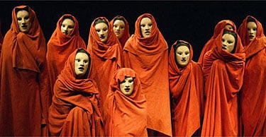
The image above is taken from a play of what a chorus looks like, they all have masks on (typical in Greek tragedies) but they show no emotion and are all in one colour - we will follow these conventions in our Short Film.
Development on the Concept
With the concept being based around the deterioration of a girl's life we have chose to go for the more relatable reason which is her meeting a boy which then ends up badly. We have came up with a few different reasons as to why it goes bad but we will choose once we have gained audience feedback to see what they would prefer to see which will hopefully help increase our audience.
Another thing we are planning to include is a 'chorus'. Chorus's are mostly seen in the typical Greek tragedy however we have decided to use a more modernised type which we will keep cutting back to throughout; this will show the audience what is going on throughout the film as the character that is the chorus is a symbol of Zoe's emotions. We are going to give the character in the chorus a prop which will be key to reflecting Zoe's feelings.
Ideas for the prop will follow!
(For more information of what a 'chorus' is, click the hyperlink attached to the word)
Wednesday, 14 November 2012
Viewers

Twitter...
I have shared my blog to my Twitter followers to increase awareness about it, sort of my own way of viral marketing. Hopefully it will encourage people to visit my blog and possibly comment on my work. In doing so it is somewhat my own type of Viral Marketing which will increase awareness of my Short Film.
Tuesday, 13 November 2012
The Concept
With our concept initially being about the deterioration of a girls life, we have developed it further. As oppose to it being centred around grief and upset, we have started it off with the typical equilibrium following Todorov's theory. The disequilibrium is going to be an issue that most teenage girls have and that is... boys. This way it appeals to our target audience as they could relate to the situation being shown (break ups) and it is also a lighter subject matter that can be portrayed fairly easily; this allows me to be experimental when it comes to my role in post-production.
Wednesday, 24 October 2012
Short Film Analysis
Surfacing by Jessica Green
Surfacing from Jessica Green on Vimeo.
Mise-en-scene
The costume is the conventional clothing that a teenager wold wear, just normal t-shirt and pants, this denotes that the person is just your average young adult. However, we see a transparent piece of material in front of her throughout which is visible due to the light shining off it, this gives us the idea that the girl is trapped, but to what it is we do not know. The location shots are just normal, bright places which contrasts with how the girl is feeling, this gives off connotations that she is intimidated by her surroundings as they are the opposite as to what she is feeling which we can tell by the expressions on her face. As the sequence progresses, emphasising how tedious this whole experience this is for her, her clothing changes from being yellow, bright and cheerful t-shirt to a blue jumper, which connotes that her feelings are getting worse and she is becoming more emotional; by her covering up more of her body, denoting that she is no longer comfortable in her own body so she's hiding away.
Cinematography
Instantly starts as an extreme close-up on the girls eyes, showing her look of worry. It's not very clear at first, then it cuts to the girls point of view, which then shows that something is covering her view. There are a lot of various different angle shots to show the girls isolation for example when there is a longshot showing the girls confusion and distress of her walking in circles. It seems to be that a handheld camera is used at first then when it has to be a steady shot which emphasises on the girls face to let the audience feel empathetic for her. There are several different shots when showing the different people who are talking about her.
Sound
The sound in this at the beginning is just a fairly ordinary noise which is expected in a communal area, people talking, things rustling; however, in this case, linking with the cinematography it is obvious the girl feels a division between herself and the rest of the people as she is not interacting with them, she is just listening - denoting that she is left out. There are several bangs, for example when the door slams shut which could represent the girls anxiety
Short Film Anaylsis
Wasp by Andrea Arnold
Wasp by Andrea Arnold from MrGreatShortFilms on Vimeo.
Mise-en-scene
Instantly the shot shows a dirty set of stairs with children walking in their bare-feet. The clothes they are wearing are extremely washed out and some of them are dirty, this denotes that the family (with an unknown/absent father) are from a rough area due to the filthy stairs and the clothing they wear. The young baby who is being carried carelessly by his oldest sister (who still looks young) is half-naked, this also denotes that the family are not wealthy and are in a place where walking round like this is acceptable. All of the children and the mother are untidy and look as thought their appearance is not looked after, they contrast with the other children and parents as they look fairly cleaner than them with newer looking clothes, which reflects the poor circumstances that the main character lives in and the poor living environments.
Other points:
- Bag of sugar as an alternative for a meal - extremely poor, borderline poverty giving off connotations that the family are probably at the bottom of the social scale. The mouldy bread also shows this as nowadays it isn't that expensive for a loaf of bread and she cannot afford that.
- All of the empty wrappers in the cupboards and on the bench denotes that she is too lazy to tidy up - not fit for parenting, some of the rubbish could be dangerous which is not acceptable as there are 3 young children and a baby which could hurt themselves on something.
- Pub scene - she wears a red top which denotes romance which could be as she is going to see a male, but it could also symbolise danger for something that is going to happen when she is there. Even when she attempts to dress up for the occasion she still looks dishevelled.
Cinematography
Throughout this short film it appears that a handheld camera has been used all of the time. Firstly, it is used when they are coming down the stairs almost as if that is how they're moving. The shot stars with a close up on her thighs which lets the audience see the clothes they are wearing, it then pans down to the feet, which is to show that she is bare-footed. With it starting at the bottom, it allows the audience to see what type of place that these people are living in - dirty, dark, unhomely. The use of the handheld camera could also be used to show the carelessness that these people live like. The shots, when not outside in the daylight, are always dull. Some of the shots are extreme close ups especially when her past lover is talking. It focuses on his mouth at first which gives off connotations of persuasion and mesmerisation in what he is saying, it then changes to an extreme close up of his eyes which also gives off the same idea.
Sound
There is not much to say about the sound as it is just very basic and there are no special effects. However, there is a lot of colloquial language i.e. the use of swear words - this reflects the type of people that Arnold wants the audience to perceive them as. The mothers voice is also very rusty which makes her sound common. The children also use bad language which shows that they have had a bad upbringing.
Edits
This is a very basic short film and there has not been any edits, just simple cuts and focuses on certain things. I believe Arnold hasn't used any particular edits for example transitions due to the subject matter being a serious, stereotypical thing which needs to look realistic as oppose to there being a lot of edits to make it seem fictional. Arnold tries to make the audience feel empathetic for these children and in some ways the mother as it is something which is common in areas like this.
Overal - the main technical code is mise-en-scene as it is extremely important that the audience knows just what kind of conditions these people live in.
Tuesday, 23 October 2012
Further Analysis of Short Films
As we were undecided on whether we were going to produce a trailer or a short film, I only analysed one short film. Kelsey and I have agreed on a short film therefore I have to analyse moreof them to understand the concept of them all.
Thursday, 18 October 2012
A2 Project Brief
Which brief are you pursuing?
The brief I am pursuing is a Short Film, therefore I am planning on analysing more short films as in my other analysis I have only included 1 short film because I was unsure on what brief I was anticipating on pursuing.
Identify if this is an individual or group project?
List the roles and responsibilities if you're working in a group?
Mise-en-scène - Kelsey Wink
Cinematography - Katie Murdoch/Kelsey Wink
Sound - Katie Murdoch
Editing - Katie Murdoch
Acting - Kelsey Wink, Zoe Slade and Stephen Hanlon (main characters)
Write a brief summary of your concept for the main task:
The concept of our short film is based around the deterioration of one girls life (Zoe Slade). We have not decided upon the final reason for this but it will more than likely be due to relationships or issues that teenagers face everyday. It will first appear happy then there will be a disequilibrium, following Todorov's theory.
List any ideas for locations (mise-en-scène):
Stereotypical places where teenagers go:
- City Centre (Newcastle)
- City Centre (Newcastle)
- Café's
- The beach
- Shops
- Parks
List any ideas for costume and props (mise-en-scène):
Costume:
Normal clothing that teenagers would wear, in doing so it will relate to our target audience. Items of clothing such as jeans/leggings with a smart/casual top for Zoe and a smarter look for Stephen as nowadays boys make more of an effort with their appearance to previous years.
Make-up:
Normal make-up to make Zoe appear natural and innocent.
Make-up:
Normal make-up to make Zoe appear natural and innocent.
Props:
We do not particularly need any props in our film that stand out just typical things found in the places where we will be filming, for example we will have mugs of coffee/tea in the café's etc.
Setting:
Light places which show life and energy, like busy shopping centres/stores which will be in Newcastle but also quieter places to show the relationship between the two people being more confined and emotive.
Outline your ideas for each ancillary task:
For one of my ancillary tasks I am intending on creating a poster to sum up the short film without telling you what actually happens. It will hopefully be a medium shot of the girl in the centre of the poster with Stephen behind. Zoe will appear upset but Stephen will appear emotionless.
The second ancillary task will be a magazine review article about the film.
Concept Ideas A2
If the Slideshare doesn't work, maximise it using the button at the bottom right then hopefully it should work :)
Tuesday, 2 October 2012
Reviewing Last Year's Practical Work
Reviewing Last Year's Practical Work on Prezi
I have reviewed my practical work that I completed last year as this year I will have to complete ancillary tasks which are similar, by doing this I can see what I need to improve! :)
I have reviewed my practical work that I completed last year as this year I will have to complete ancillary tasks which are similar, by doing this I can see what I need to improve! :)
Wednesday, 29 August 2012
Trailer/Short Film Analysis
Trailer 1: The Strangers
Firstly, this trailer at first is not obvious to what genre the film is going to be due to the romantic feel we get from the mise-en-scene, for example when there are petals on the bed sheets, candles on the set dining room table suggesting a romantic meal and also when the male gets out a ring box and says "you're my girl", the music in the background is also a soft piano which is fairly peaceful. This all changes when there is a sudden bang, alerting the audience that this film is going to be a horror. Although the piano continues playing, there has been added non-diegetic sounds increasing the tension, for example the creaking noise which we then later find out is the swing, moving by itself. The fade transition's in between shots builds up the tension, drawing in the audience into wanting to see more. The shots are also only on screen for about 2 seconds before text appears, which is talking about the film, but it is broke up into 3 different parts so that the audience wants to know what is going to be said i.e. 'we always tell ourselves' 'there's nothing to fear' 'but sometimes we're wrong'. I think that the text in between shots is a good way to draw the audience in. The cinematography in this trailer varies going from close-ups to show how they are feeling to long shots, which shows the audience their surroundings, in which they are not safe. By it going into long shots it lets the audience see everything that is around them, letting them believe she is safe in their own environment, however she is not which we see by the masked manly figure appearing from the hallway.The music later on in the sequence changes from a peaceful record to it then being stuck and jumping, which is also echoed in the way the shots are then jumping too, creating an edgy feeling towards the end of the trailer.
Trailer 2: The Ring
This trailer is dull throughout, using cold colours to give the audience an implication that this trailer is based on the horror genre. Instantly there is non-diegetic speech asking a question: "have you heard about the video tape that kills you when you watch it?" which lets the audience know the genre. The dialogue matches what is going on in the trailer at the start, as it shows the video. The video is extremely creepy and weird, which gives the audience a feel of what the film is going to be like. The actors used are all fairly normal apart from the young boy who is purposely set out to be creepy. There is a constant music being played in the background which, although it is a piano similar to The Strangers trailer, it is different in this as it seems to be eerie and creepy. The tempo in the music then gets quicker as the trailer goes on, creating more and more tension. The movement from then on gets faster from the people inside and the clips get shorter. Near the end of the trailer there is a young child whispering "everyone will suffer" which also gets the audience reeled in as they will want to know why. I like how it's a young child's voice being used as if it was an older person it would not be as scary.
Short Film: Fewdio - Mockingbird
The mise-en-scene in this short film is extremely important in understanding what is going on in it. The sequence starts off with the camera facing his back just at the right height for the audience to see what is on the man's desk. With it being during the day, it gives off connotations that he works from home, and with the mac computer on his desk with stationary in a holder also implies that he works at home. As the camera pans around to the man's face he hears the baby monitor which then changes shot from the man to only on the baby monitor, this gives off connotations that this is going to be a main part in this short film. As he hears the baby crying then his mother singing to him he picks up the picture of his wife and baby and smiles, this implies that he loves these two more than anything in the world. The genre is also not a horror at this point which then dramatically changes as the camera then focuses on the doorknob moving and being unlocked; by the man thinking that his wife is with his child, he is confused as to who it could be which builds up the tension until the camera then swaps from a close-up on the doorknob to a medium-long shot of his wife, which we know who she is from the picture on his desk. Once they both look puzzled at each other the music then builds up an eerie sound, creating a tension for the audience. The sound is then changed again to the baby crying louder than the other times and then the creepy singing stops, we then hear the two parents whaling in disbelief repeating the non-diegetic dialogue "why why why" - leaving the audience shocked.
Thursday, 3 May 2012


Wednesday, 2 May 2012
Monday, 30 April 2012
Tuesday, 24 April 2012
Tuesday, 17 April 2012
EVALUATION - How does your media product represent particular social groups?
On my front cover, it is apparent that I have used an attractive young girl to appeal to an audience as “pernicious distortions of reality … they (women) are used to sell the products they buy” – Davies et al (feminist group). However, because we live in a patriarchal society, I have stuck to conventions in doing so, although this is taking advantage of her looks, it is in a beneficial way as it appeals to not only the male population as they may be engrossed by her, but also women too because as she is the only one on the front cover, it makes her look powerful and dominant, which could lead to women wanting to look like this too as they want to be the subdominant gender, resulting in them buying the magazine because they see the woman as a positive role model. Although American feminist Naomi Wolf believes that women are conditioned to looking a certain way because of society, I believe this is a positive thing because it not only appeals to women, but it also appeals to men, hopefully resulting in selling more copies of my product.
Monday, 16 April 2012
EVALUATION - In what ways does your media product use, develop or challenge forms and conventions of real media products?
When creating my media product (music magazine), I thoroughly researched into existing music magazines which are successful and well-known, such as Q and Kerrang; I researched into these types of magazines because I would like my product to be to a professional standard, similar to the magazines I researched. I would also like it to be of a similar genre to the magazines I looked into, therefore I tried to create a similar style but I developed some of their features and made them my own style. I chose only to use one main image as it is the usual conventions of a music magazine to try to attract an audience by setting the tone of the magazine by the type of image, for instance if it was for a girly magazine such as Top of the Pops, the cover photo would be of a pop sensation that appeals to a younger audience such as Cheryl Cole, One Direction or Justin Bieber. But if it was of a rock genre, the front cover would be more likely to be a band or a main member of a band such as Blur or The Killers as they’re more likely to be in a magazine like Q or Kerrang because of their type of music and also, normally younger people do not listen to music like this, therefore the house style of these magazines will have a more professional look about them. This type of house style is what I tried to achieve.


The TOTP magazine has a house style which would appeal to a younger audience, with the purple, pink and white. The magazine with Justin Bieber as the main image is bright pink which directly appeals to younger girls as they know he's the popstar that appeals to a lot of girls which will attract them into buying the magazine. The language used also appeals to a younger audience e.g. "Shopping Heaven!" and "Snuggle up to One Direction! Cute pics inside"
These type of magazines contrast with magazines such as Q and Kerrang!:


Although Kerrang! is not organised into neat columns like Q, it is in an "organised mess", which fits the genre of the type of music the magazine is about. Kerrang! is more into rock music which fits with the edgy layout on the front cover. I have used a mixture of edgy and organised when creating my music magazine front cover because as well as wanting it to be professional, I also wanted the audience to immediately know what type of genre the music magazine was by the layout and house style.
I have followed the conventions of Q portraying the model different to what she's originally like to fit a certain persona for the magazine - Cheryl Cole is more likely to be the type of person she's portrayed in the TOTP magazine (girly and smiley) whereas she is portrayed as being sexy and provocative to fit the genre of the magazine. I have done this in my own way by editing the image of my model to fit the persona I was aiming for her to be - feisty and punky.


The TOTP magazine has a house style which would appeal to a younger audience, with the purple, pink and white. The magazine with Justin Bieber as the main image is bright pink which directly appeals to younger girls as they know he's the popstar that appeals to a lot of girls which will attract them into buying the magazine. The language used also appeals to a younger audience e.g. "Shopping Heaven!" and "Snuggle up to One Direction! Cute pics inside"
These type of magazines contrast with magazines such as Q and Kerrang!:
Although Kerrang! is not organised into neat columns like Q, it is in an "organised mess", which fits the genre of the type of music the magazine is about. Kerrang! is more into rock music which fits with the edgy layout on the front cover. I have used a mixture of edgy and organised when creating my music magazine front cover because as well as wanting it to be professional, I also wanted the audience to immediately know what type of genre the music magazine was by the layout and house style.
I have followed the conventions of Q portraying the model different to what she's originally like to fit a certain persona for the magazine - Cheryl Cole is more likely to be the type of person she's portrayed in the TOTP magazine (girly and smiley) whereas she is portrayed as being sexy and provocative to fit the genre of the magazine. I have done this in my own way by editing the image of my model to fit the persona I was aiming for her to be - feisty and punky.
Monday, 19 March 2012
Wednesday, 1 February 2012
RESEARCH - Music Magazine Questionnaire
I created a questionnaire to gather information to see what type of things people prefer in a music magazine and what they might like to see inside it:
1. Male or Female?
___________________________________________________________
2. How old are you?
14-15 16-18 19-21 22+
3. Do you like music?
Yes No
4. If so, what is your favourite genre?
___________________________________________________________
5. Do you normally buy music magazines?
Yes No
6. If not, why?
___________________________________________________________
7. How much would you be willing to pay for a music magazine?
£1-1.99 £2-2.99 £3-3.99 £4+
8. What would you like to see in a music magazine?
___________________________________________________________
9. Who is your favourite band/singer/producer (DJ)?
___________________________________________________________
10. Do you often go to festivals or gigs?
___________________________________________________________
11. If so, roughly how many times have you been altogether?
___________________________________________________________
12. Does the music you listen to influence your style?
Yes No
13. If Yes, why?
___________________________________________________________
14. Do you download music?
Yes No
15. Do you prefer downloading music as appose to buying CDs?
___________________________________________________________
___________________________________________________________
16. How do you listen to music?
iPod Online Television Radio CDs Computer/Laptop
iPod Online Television Radio CDs Computer/Laptop
17. How often do you prefer magazines to be brought out?
Weekly Fortnightly Monthly
Weekly Fortnightly Monthly
18. Would you be encouraged to buy the magazine if it included free gifts?
Yes No
Yes No
19. Do the images on the front of a magazine draw you in to buying it?
Yes No
Yes No
20. Would you prefer articles about local bands or well-known bands?
Local Well-known
Local Well-known
Subscribe to:
Posts (Atom)